

📍 Based in Tbilisi

📍 Based in Tbilisi
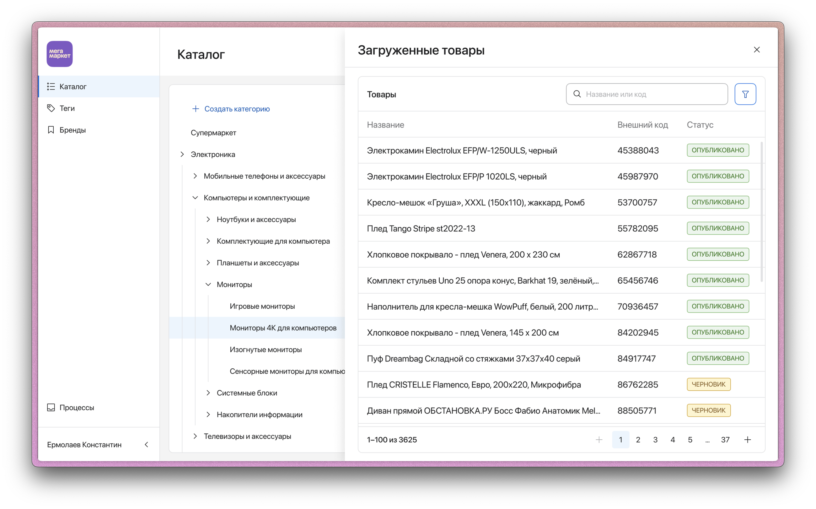
At Samokat, I worked on the UX/UI of an internal Catalog Management System (1073 users) used by the content team to manage the product catalog for both the mobile-app and web-version. The platform was used daily to edit product cards, upload images, configure structure of catalog and launch updates.
Since the users didn’t have a technical background, it was critical that the interface was intuitive and supported fast, error-free work. I was responsible for the full design cycle — from user research and feature design to prototyping, implementation support, and iterative improvements.
1. +60% increase in category-to-purchase conversion through improved navigation and attribute-based filters
2. –23% reduction in product onboarding time thanks to a redesigned product editor and simplified workflows
3. –17% decrease in support requests related to CMS usability issues
4. Reduced the time required to push products to the top from 60 hours to 15
– Redesigned the product editor interface, improving clarity and batch-editing capabilities.
– Implemented an attribute-based model and unified category hierarchy («Info-Hierarchy»).
– Introduced reusable components from the internal design system, improving consistency and speed of delivery.
– Collaborated closely with the content and engineering teams to identify workflow bottlenecks and optimize high-frequency tasks.
These improvements turned the CMS into a reliable, scalable internal tool that helped the content team manage hundreds of products daily in a fast-changing environment
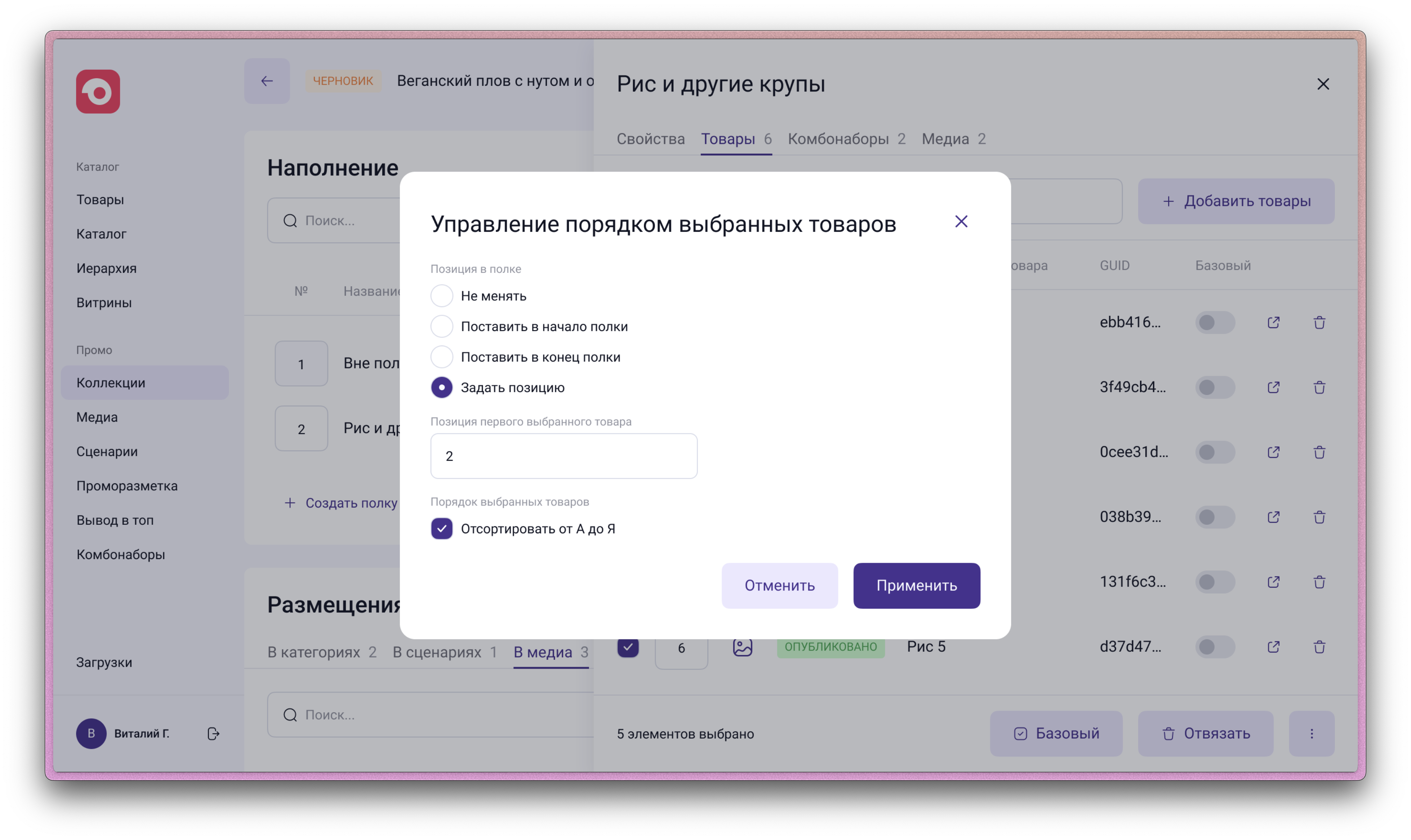
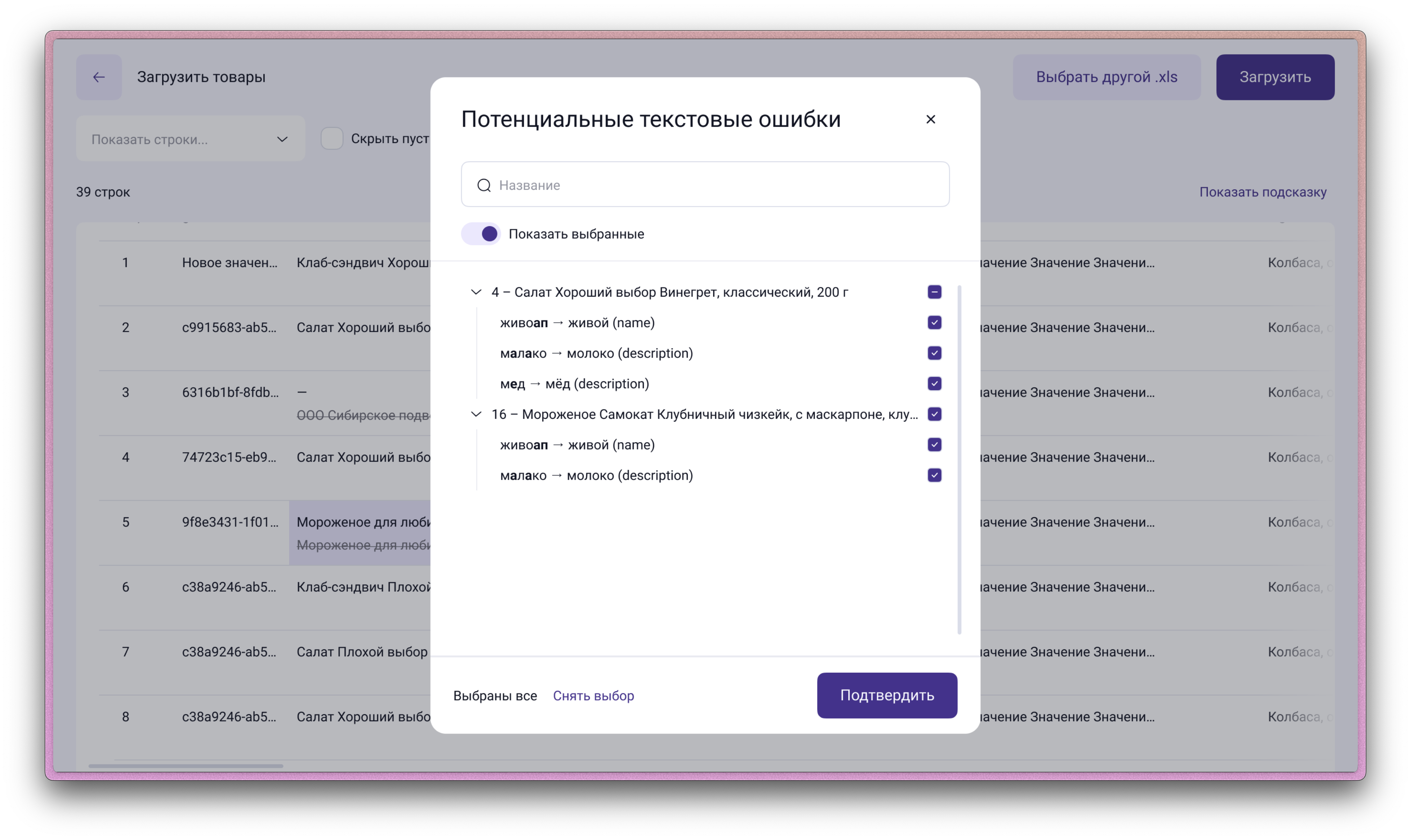
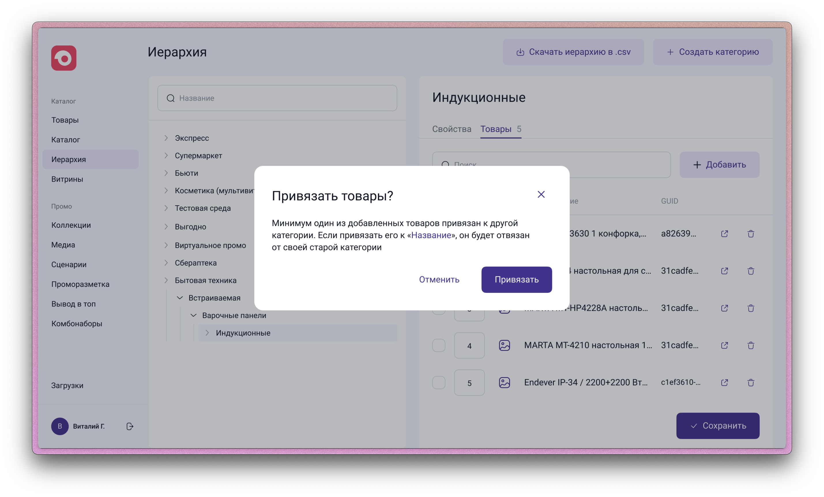
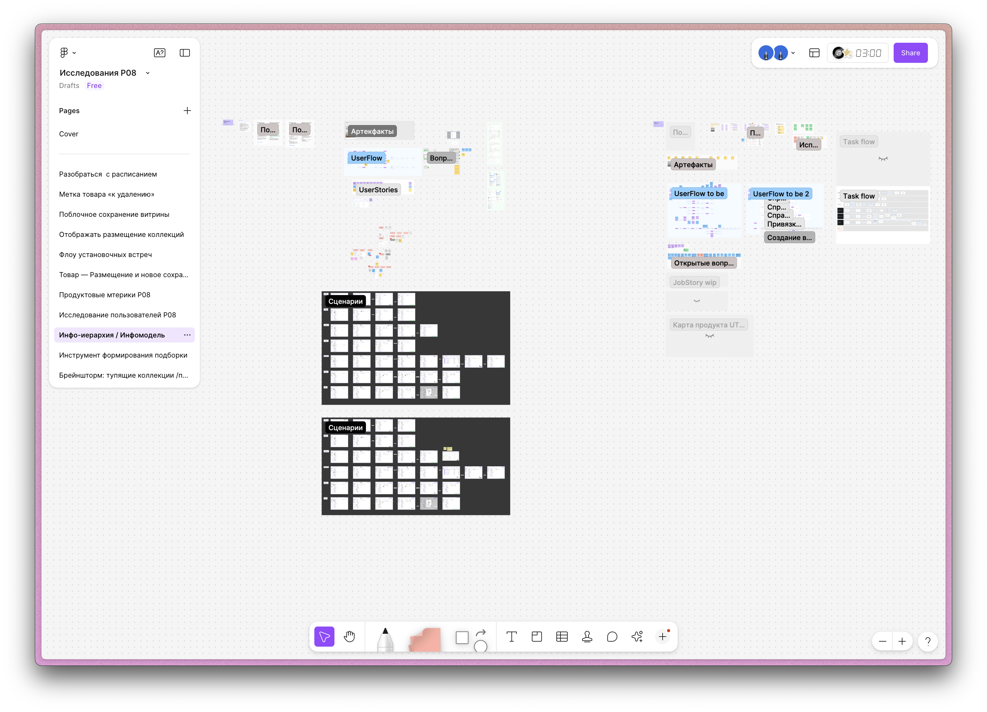
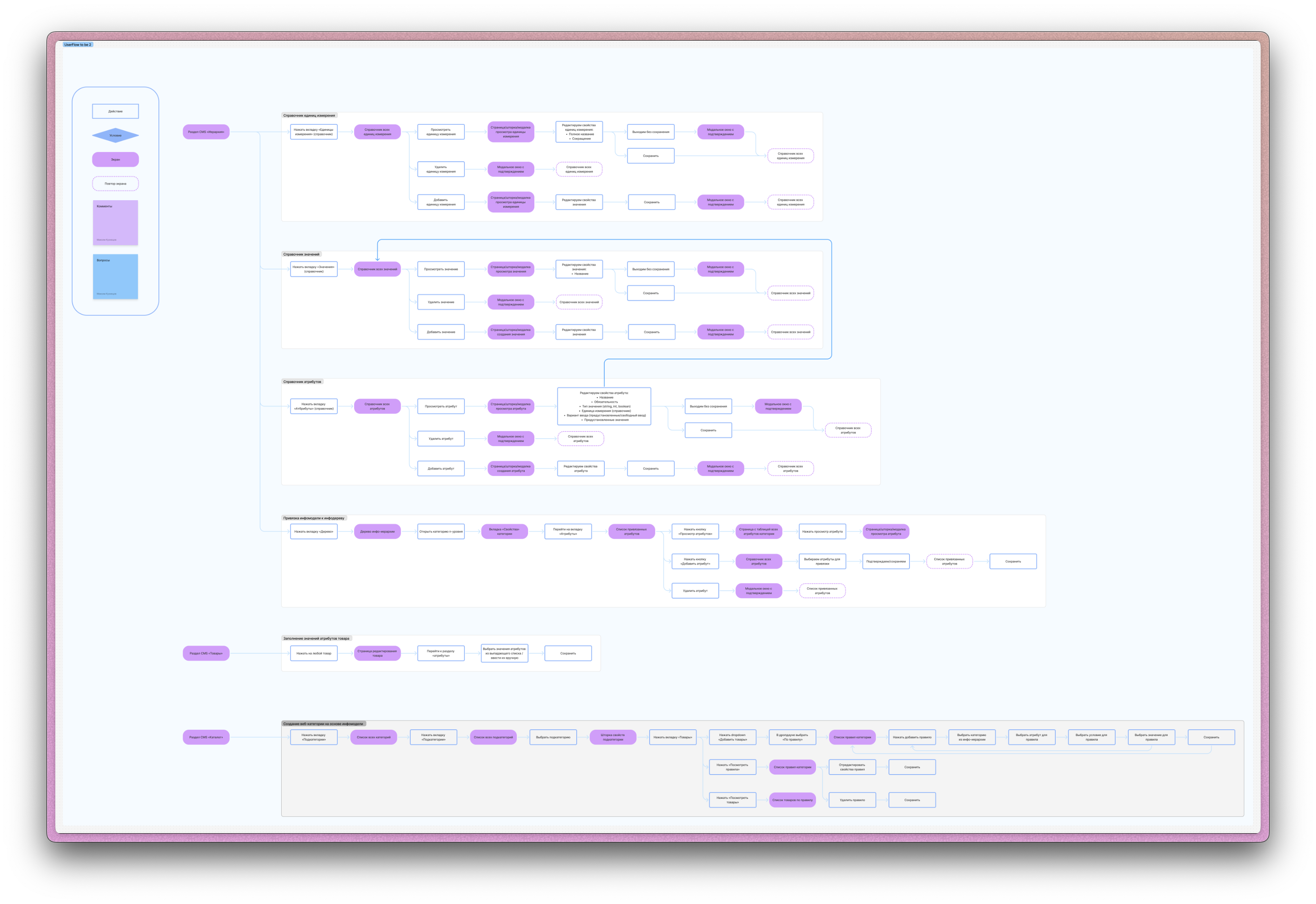
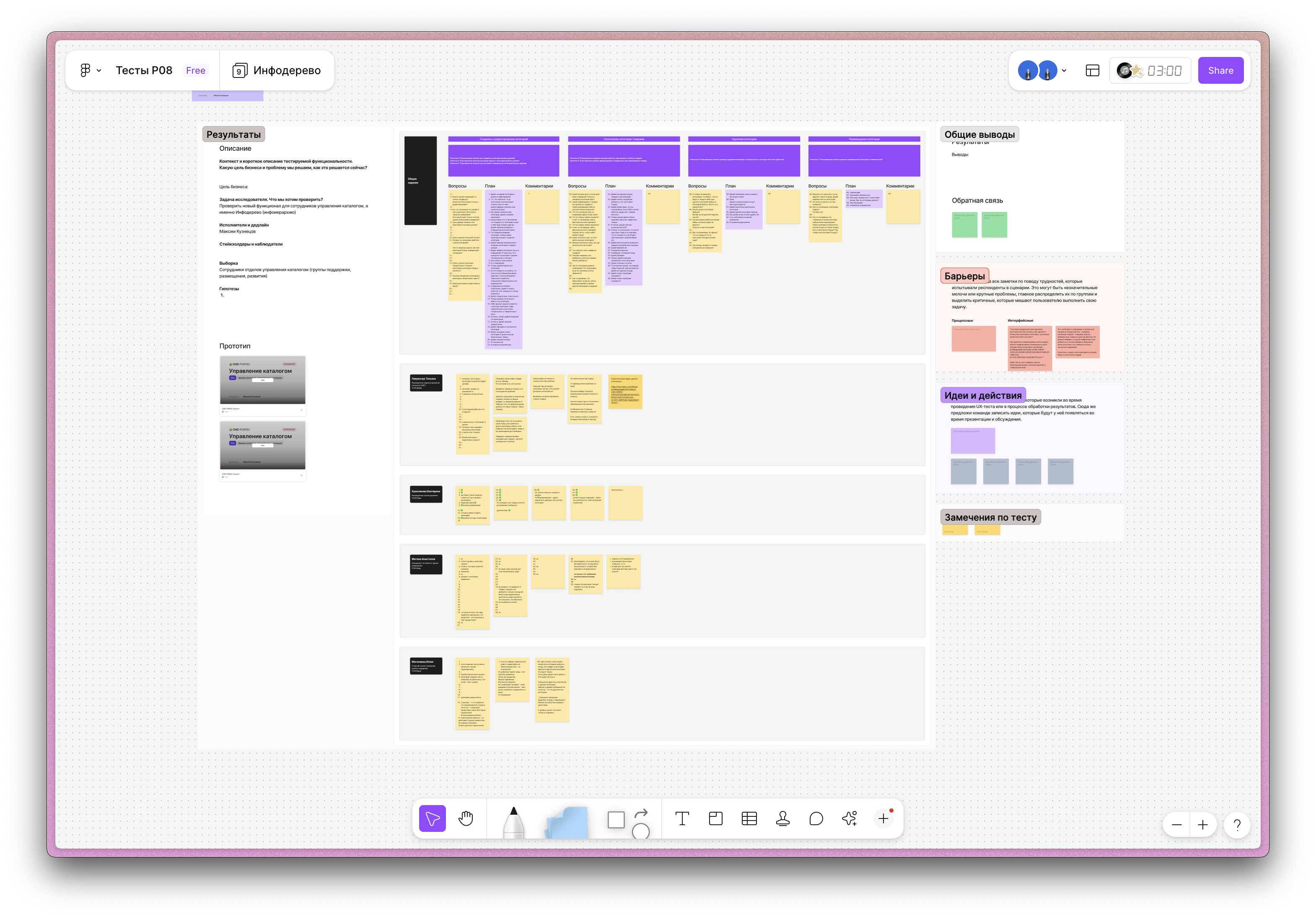
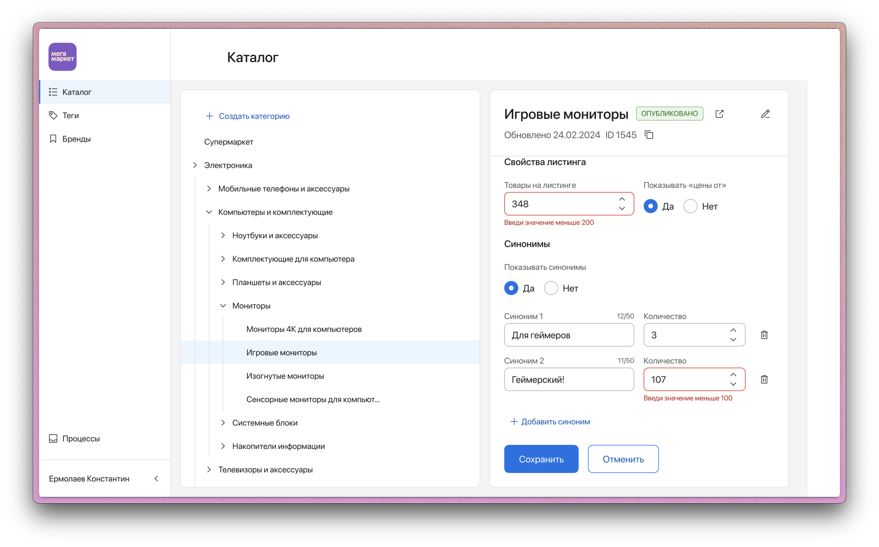
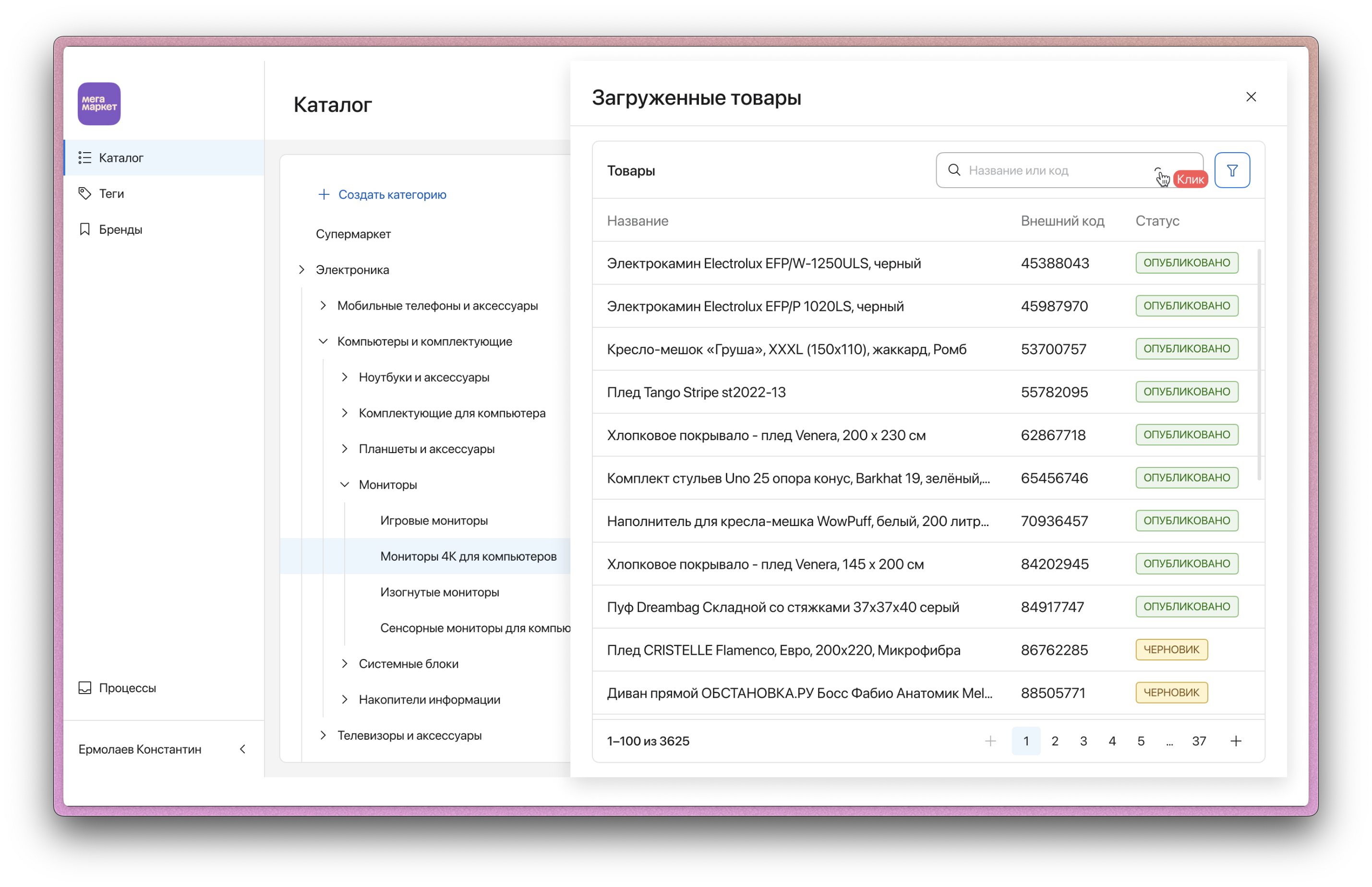
For a long time, content managers (162 users) worked in an outdated system (a desktop application), which limited scalability for new requirements and complicated their daily workflows. My task was to analyze the legacy system, study users’ task flows, identify stakeholder goals, and design the architecture of a new CMS that would meet both business and user needs
1. Launched from scratch in 5 months
2. Reduced the effort required to create the attribute model for a product category from 2 FTE to 0.8 FTE
3. Reduced the number of support requests in the «Collection Composition Issues» category to 3%
– Designed the system architecture while accounting for business constraints and the mistakes made in the legacy system’s design
– Eliminated the need for users to rely on Excel for data entry
– Designed block-level data saving to prevent collisions
A system was developed that significantly accelerated user workflows. The project was later put on hold due to a shift in the company’s goals and the overall product architecture


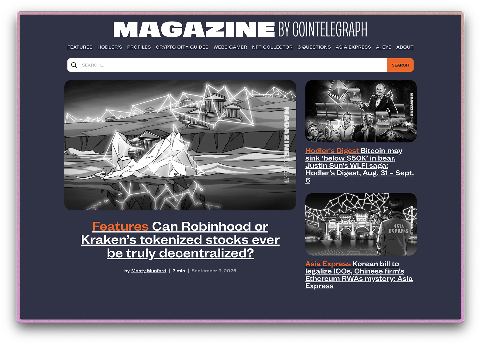
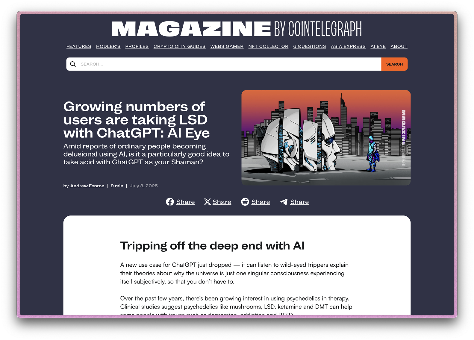
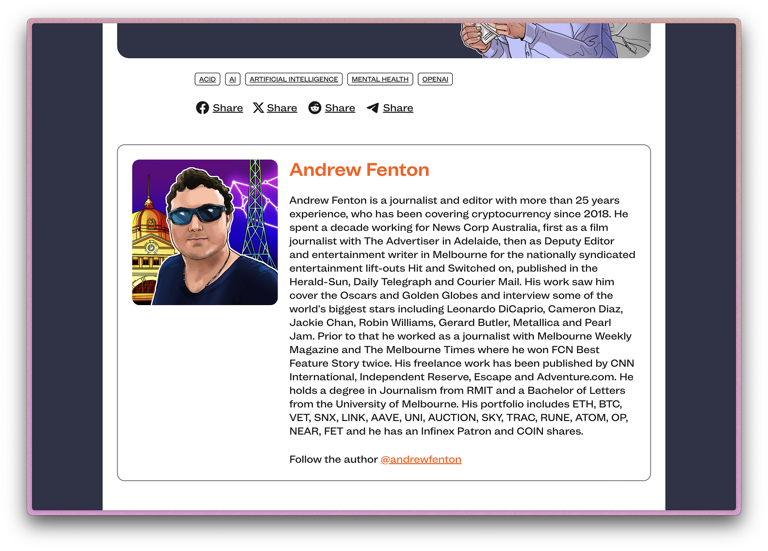
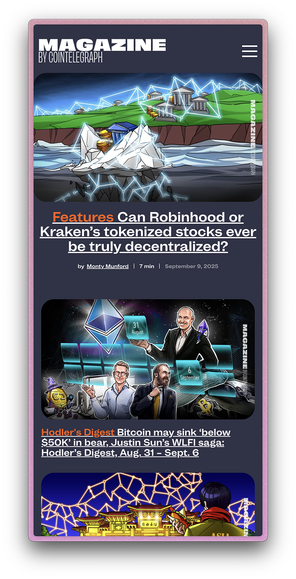
Cointelegraph Magazine is a new publication that goes beyond the daily news and delves much more deeply into the stories, trends, and personalities that inspire cryptocurrency and blockchain conversations around the world.
Was designed style guide and kept figma file with components.



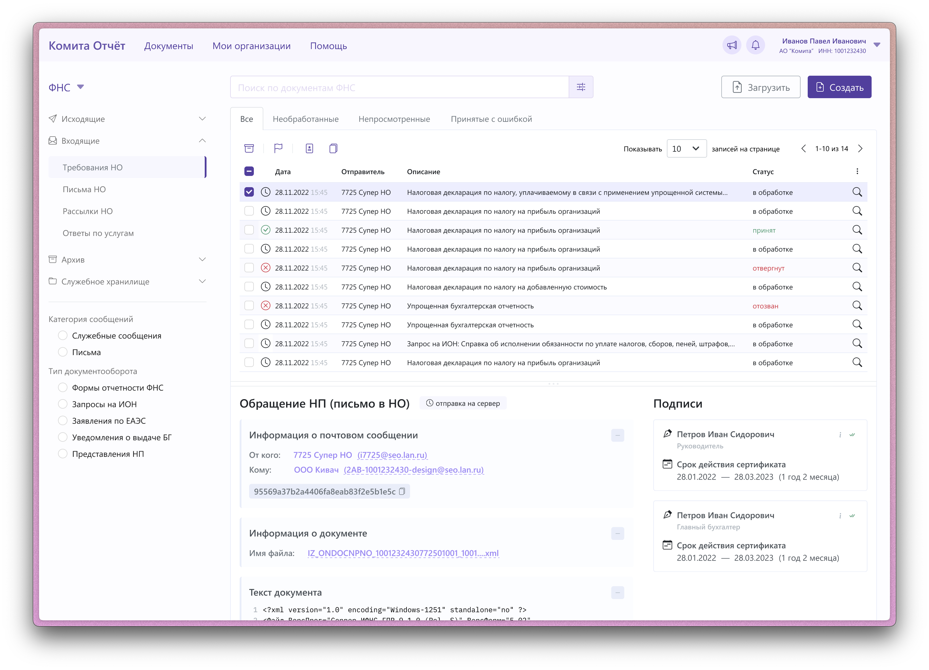
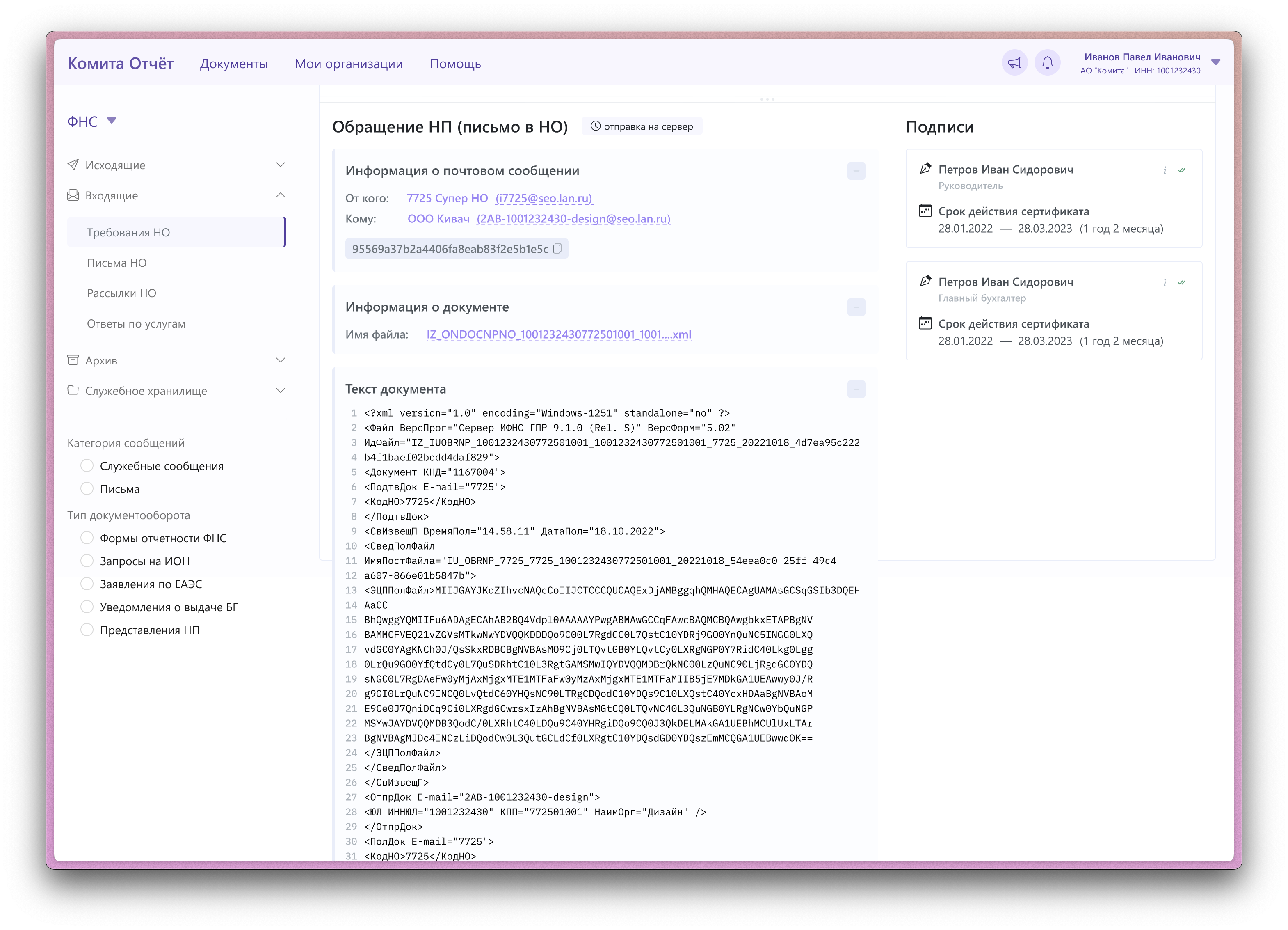
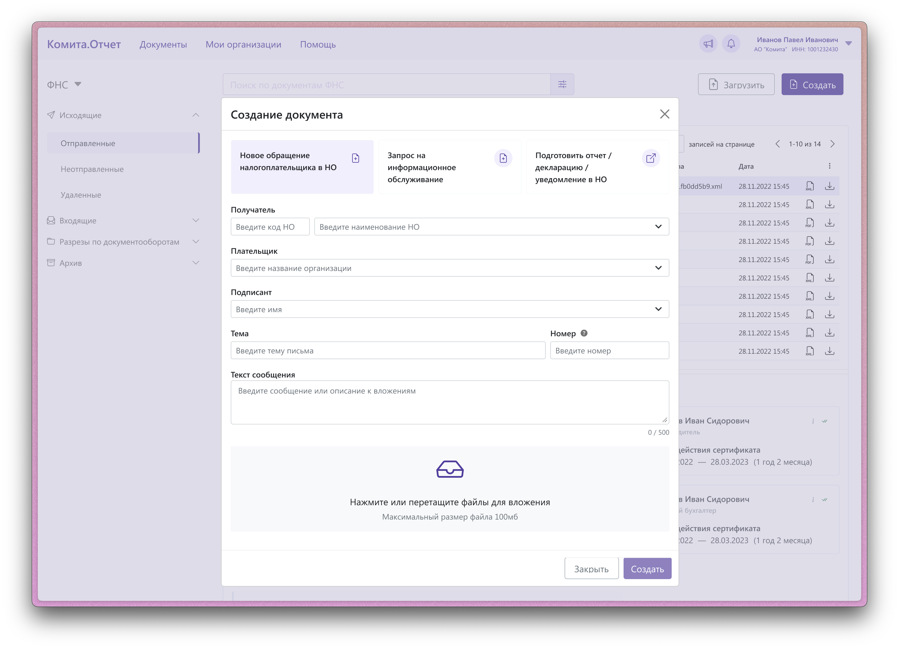
For a long time, there was a system called «Comita.Otchet». Officially, it was described as a «reporting system in electronic form via telecommunications channels using means of cryptographic information protection». It existed as a desktop application for Windows systems, but became outdated over time. The task was to turn the 20-year-old desktop application into a web product. There were numerous design limitations from both the client's and functionality perspectives. The main challenge was to fit all the functionality that had been continuously added over 20 years into an interface that was understandable and simple for this task.
The interface was cleared of legacy elements, and a lightweight version of the web interface was developed. Unfortunately, no project metrics were collected

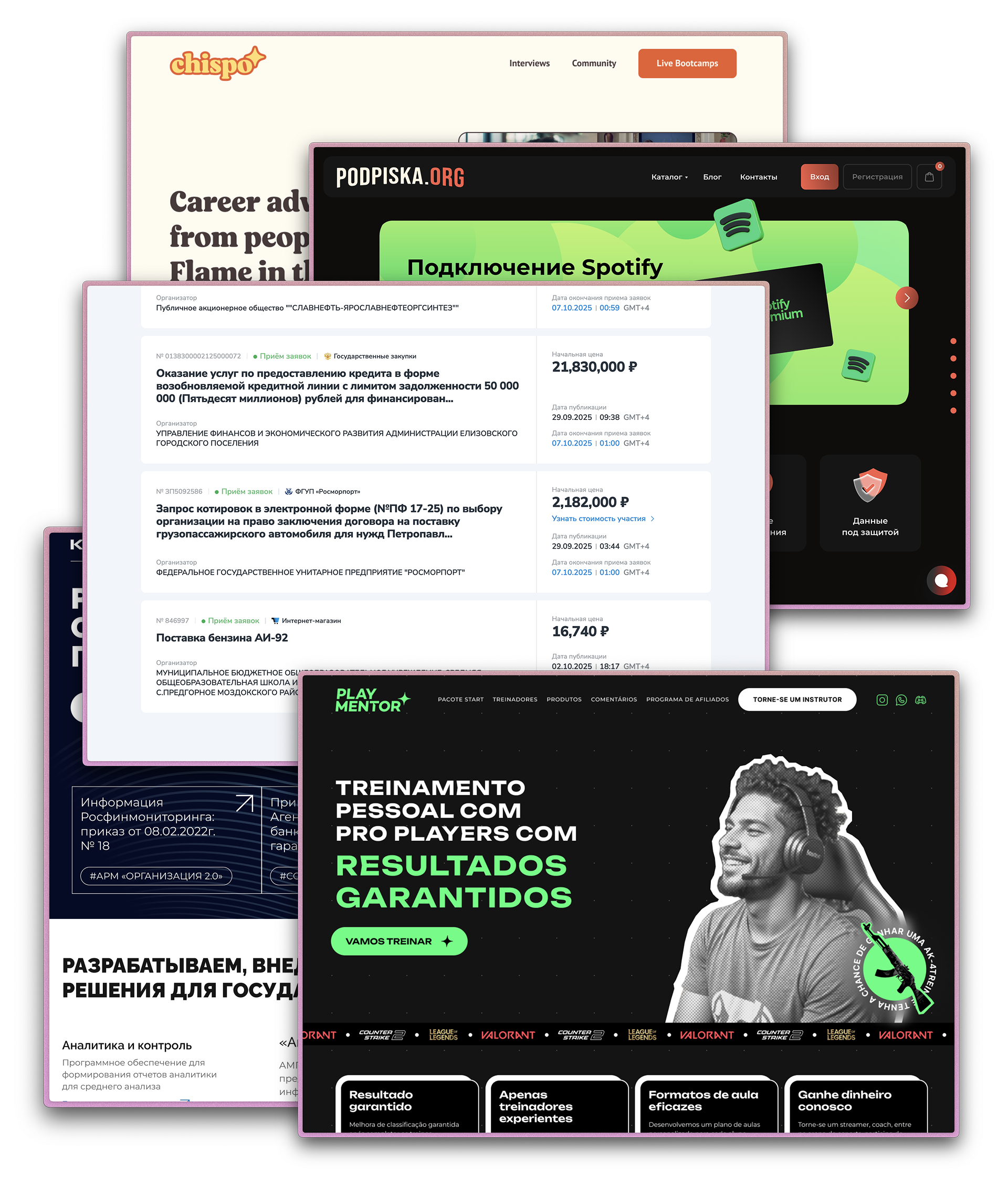
Startups, Esports EdTech, EdTech, blockchain, tender platforms, landings for it companies etc.

Work inquiry or question?
Email me, linkedIn me, telegram me